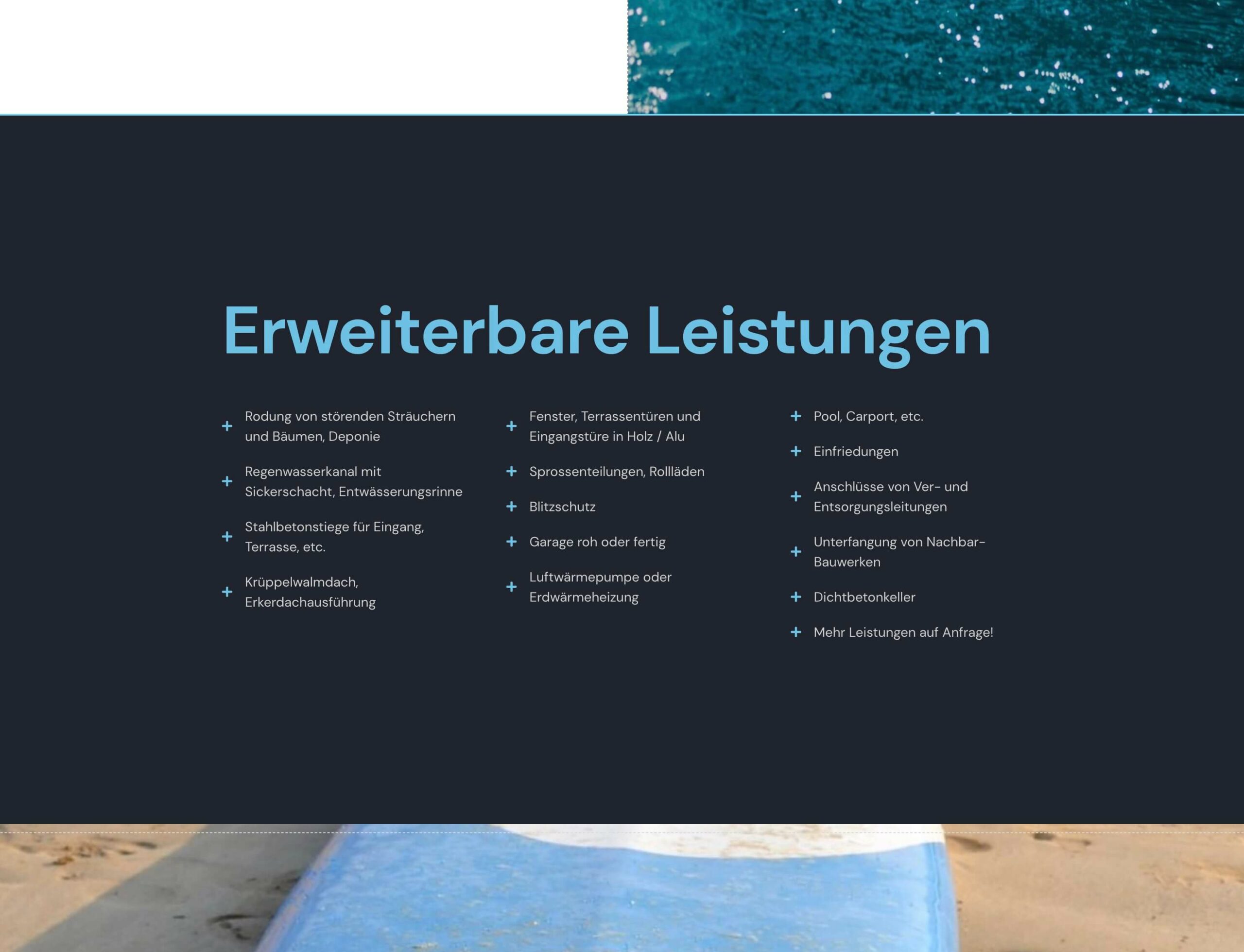
With the list icon widget in Elementor you can add nice lists of icons to your website. But what I miss is the possibility to split long lists into multiple columns. In this article I show you how to get multi-column lists with a little CSS.
Of course, you can play around with multiple columns or containers side by side, so that you split a long list into multiple lists in containers and then adjust their widths. But this is not so nice in handling and creates additional, in my opinion unnecessarily nested lines of code, which can (minimally of course) affect the loading time.

Instead, you simply create a single list and set the number of columns with a little CSS code. You can insert the CSS code for example in the „Advanced“ tab under „Custom CSS“. With „selector“ then always the respective widget is addressed.
(You can also assign a class to the widget and then address the CSS in your theme with the class).Instead, you simply create a single list and set the number of columns with a little CSS code. You can insert the CSS code for example in the „Advanced“ tab under „Custom CSS“. With „selector“ then always the respective widget is addressed.(You can also assign a class to the widget and then address the CSS in your theme with the class).
In my example, I want 3 columns with a bit of spacing of 5% between columns:
selector{
    columns:3;
    column-gap: 5%;
}
and already the list is divided into 3 columns. The number of entries per column is set automatically.
But what you have to notice now is that the list is now always displayed in 3 columns, even on smaller screens, so the texts have no more space.
For this we extend the CSS with 2 media queries:
@media screen and (max-width:1024px){
    selector{
        columns:2;
    }
}

@media screen and (max-width:767px){
    selector{
        columns:1;
    }
}
Explanation:
At a screen size of 1024px width maximum (which is the default „tablet“ breakpoint set in Elementor), the list should split into 2 columns and at a screen width of 767px maximum („mobile“ breakpoint), the list will be displayed in one column.Explanation:At a screen size of 1024px width maximum (which is the default „tablet“ breakpoint set in Elementor), the list should split into 2 columns and at a screen width of 767px maximum („mobile“ breakpoint), the list will be displayed in one column.
Did the code help you? Write a comment!


2 Responses
Hi, I don’t speak German, so hopefully this translates well. I wanted to make a small correction to your code snippet. The @media tag for for desktop should target min-width instead of max-width, otherwise it doesn’t change anything. Thanks so much for writing this article, it helped a lot!
@media screen and (min-width:1024px){
selector{
columns:2;
}
}
@media screen and (max-width:767px){
selector{
columns:1;
}
}
Hello Natalie,
depends on how many columns you want to display. In my code in the article it’s set to:
So it’s everywhere set to 3 column and declare the tablet and mobile view columns with max-width.
With your min-width:1024px nothing’s set between 767px and 1024px (tablet view) – except you have set it somewhere else.